Understanding Color Psychology
Color psychology is a fascinating field that examines how different colors influence emotions and behaviors. It is essential in graphic design because the right color palette can evoke specific reactions in an audience, thus impacting their engagement and decision-making processes. Colors possess inherent meanings and can invoke a variety of feelings. For instance, red often symbolizes passion, urgency, or even danger, making it an effective choice for calls to action or to grab attention quickly. Conversely, blue is commonly associated with calmness, stability, and trustworthiness. This makes blue a popular choice for corporate designs, as it can foster a sense of reliability and comfort.
In addition to red and blue, yellow is another color that holds significant psychological weight. Typically representing optimism, energy, and joy, yellow can energize designs and draw in viewers with its vibrant and cheerful appearance. However, it is important to note that overuse of yellow can lead to a sense of anxiety, which must be balanced carefully within a design.
Cultural differences also play a crucial role in color perception. While red signifies good fortune and happiness in some cultures, it may represent mourning or danger in others. Similarly, white is often associated with purity and innocence in Western cultures, but in certain Eastern cultures, it may symbolize death. Therefore, designers must be cognizant of their audience’s cultural background when selecting a color palette. Understanding these nuances allows graphic designers to create impactful visuals that resonate with diverse groups, ultimately enhancing the effectiveness of their designs.
The Role of Color in Branding and Identity
The selection of color is instrumental in establishing a brand’s identity and ensuring effective communication of its core values. Colors are psychometrics used to evoke emotions, create visual interest, and enhance brand recognition. A well-chosen color palette can cultivate an immediate connection with a target audience, fostering recognition and loyalty.
For instance, the use of red by brands such as Coca-Cola conveys excitement, energy, and passion. This choice aligns strongly with its brand message, which focuses on happiness and enjoyment. The emotional response triggered by the color red has been leveraged effectively to promote the brand’s identity and values. Similarly, blue is often associated with trust and reliability, which is why companies like Facebook and Visa utilize various shades of blue in their branding. This color helps communicate a sense of security, directly aligning with their commitment to user confidentiality and safety.
Moreover, brands like Starbucks have integrated green into their branding, symbolizing growth, health, and harmony. This connection not only reflects their commitment to ethical sourcing but also resonates well with environmentally conscious consumers. Color plays a pivotal role in ensuring that these brand messages are conveyed effectively, allowing for a compelling narrative that resonates with potential customers.
When considering color in graphic design, it is essential to think about cultural interpretations and the psychological effects that different colors may impart. This can ensure that the color palette is not just appealing, but also culturally relevant and appropriate. Overall, the careful selection of color can not only enhance brand recognition but also strengthen the alignment between the brand’s identity and its audience perception.
How to Choose the Right Color Palette for Your Design
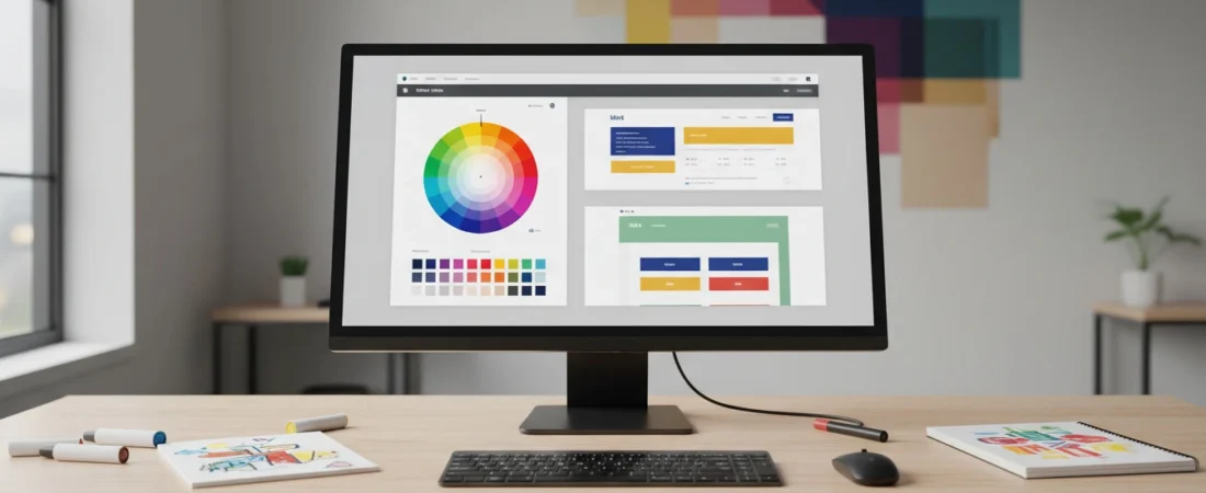
Choosing the right color palette is a cornerstone of effective graphic design. A well-thought-out color scheme not only enhances aesthetics but also impacts audience perception and engagement. To begin, familiarize yourself with the color wheel, which illustrates the relationships between colors. This tool can help you understand primary, secondary, and tertiary colors, as well as the concept of complementary colors, which are opposite each other on the wheel and create a visually appealing contrast.
When selecting colors, consider the principles of color harmony. Analogous colors, for instance, which sit next to each other on the wheel, create serene and comfortable designs, ideal for projects that require calmness, such as wellness websites. In contrast, triadic schemes—three colors evenly spaced on the wheel—offer vibrant designs that can grab attention, suitable for youth-oriented branding or creative marketing materials.
Furthermore, understanding your target audience is crucial in the color selection process. Different demographics exhibit varying emotional responses to color. For instance, younger audiences may respond positively to bright, bold colors, while older audiences might prefer muted, classic tones. Also, consider the message you want to convey through your design. Business materials may benefit from more subdued, professional palettes, whereas art projects allow for experimentation with vivid colors.
Staying informed about current trends in color schemes can also enhance your palette choices. Websites that showcase design trends often highlight popular colors, inviting you to incorporate modern aesthetics into your work. Ultimately, the right color palette not only attracts attention but also aligns with your design’s purpose, ensuring that your message resonates with your intended audience.
Tools and Resources for Color Selection
Choosing the right color palette is fundamental in graphic design, and designers today benefit from a myriad of tools and resources that streamline this process. Color palette generators are among the most popular solutions. Tools such as Adobe Color and Coolors allow users to create harmonious palettes by either generating options based on user input or through a series of preset color schemes. These platforms typically offer features that enable designers to explore complementary, analogous, and triadic colors, ensuring that they select combinations that evoke the desired emotional response.
In addition to color palette generators, color harmony tools like Paletton and Color Hunt can assist designers in understanding how different colors interact with one another. These resources often include visual aids that illustrate color relations, which can be essential for creating balance and focusing attention within design projects. Furthermore, tools like ColorZilla enable designers to extract color codes directly from sites and images, making it easier to replicate or modify existing palettes based on inspiration drawn from various sources.
For those looking to deepen their understanding of color theory and its practical applications, several educational resources are available. Books such as “Interaction of Color” by Josef Albers and “The Art of Color” by Johannes Itten provide foundational knowledge that is crucial for any designer. Online courses available on platforms like Coursera or Skillshare also cover essential concepts in color theory and its relevance to graphic design. By utilizing these tools and resources, designers can enhance their color selection process, leading to more effective and aesthetically pleasing designs.