
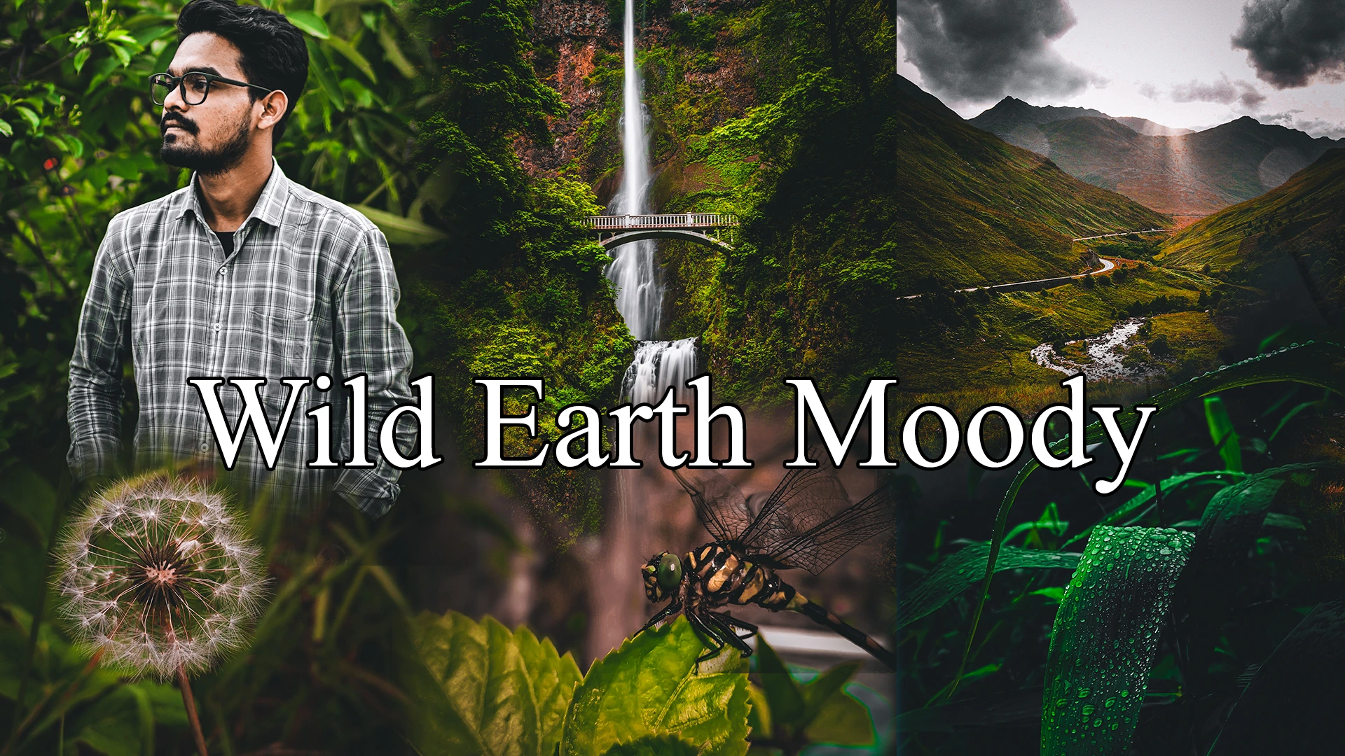
There’s a specific kind of green that shows up on your screen after an overcast shoot — flat, a little yellow, kind of tired-looking. I got sick of that green last year and built something to fix it. Wild Earth Moody isn’t a subtle “add some contrast” preset. It pulls shadows down deep, shifts greens toward something more earthy and cinematic, and gives ordinary outdoor shots a heavier, almost film-like atmosphere. The whole point was speed. One click, and a photo that used to look like a phone snapshot suddenly feels like it belongs in something bigger — no slider-hunting, no twenty minutes lost in the Basic panel.
Why I Built This Preset
I’m H.S.N.De Silva — most people online just call me Nd Silva — and I’ve spent a bit over three years now doing photo and video editing, mostly for outdoor and nature shots, switching between my phone and desktop depending on where I am. This preset actually came out of one specific afternoon shoot back in June, up in the hill country, right after a heavy shower had just passed. Everything around me was that intense, glowing green you only get right after rain. I got home, opened the RAW files in Lightroom, and felt genuinely let down. On screen, all that atmosphere I remembered standing in had turned into flat, washed-out green with barely any depth to it.
So I started fiddling with the tone curve and the HSL panel, trying to pull that mood back. My first attempt was rough — I pushed the green saturation way too hard, and skin tones in a portrait I tested it on turned almost sickly, like a bad Instagram filter from 2014. I scrapped it and started over, this time working the shadows and a subtle split tone instead of just cranking saturation. Took me about four or five real revisions before it finally felt right — not “edited,” just deeper, moodier, the way the scene actually felt standing there. That’s Wild Earth Moody. Built entirely by me, no borrowed presets, no templates underneath it.
The “Wild Earth Moody” Look, Explained
So what’s actually happening under the hood when you apply this thing? A few different adjustments are working together, not just one slider doing all the heavy lifting.
The biggest one is in the shadows. I pull the shadow luminance down further than most people are comfortable going, which is what gives the photo that heavier, almost brooding quality — but I balance it by keeping a bit of detail alive in the darkest areas so you’re not just left with a black smudge where texture used to be. Alongside that, there’s a tone curve adjustment that flattens the highlights slightly while deepening the midtones, which is really where the “cinematic” feel comes from. Straight-out-of-camera photos tend to have a very linear contrast curve; this one bends it.
Then there’s the HSL work, which is honestly where I spent most of my testing time. Greens get pushed toward a more olive, earthy hue instead of that bright, almost neon green phone cameras love to produce — think forest floor rather than fresh lawn. At the same time, I desaturate a few of the other color channels just slightly, oranges and yellows mostly, so the green doesn’t have to compete with anything else in the frame. Last piece is a subtle split tone — a touch of cool tone sitting in the shadows, a touch of warmth staying in the highlights. That’s the bit that gives shots taken during blue hour or overcast light that atmospheric, almost moody-film quality instead of just looking “dark.”
None of this needs you to touch a single slider yourself. It’s all baked into the one click.
Before & After: See the Difference
Talking about tone curves and HSL shifts only gets you so far — at some point you just have to look at what the thing actually does. So here are six pairs, all shot on different days, different light, different subjects. I picked these on purpose because they’re not all the same kind of photo.

This one’s a portrait against a wall of greenery. Look at what happens to the background — the foliage goes from that slightly flat mid-green to something much deeper and more layered, almost forest-floor colored. What actually surprised me testing this one is how the shirt held up. Plaid patterns can go muddy fast when you push shadows this hard, but the grey tones here just got richer instead of losing detail. Skin tone stayed warm and natural too, which wasn’t a given — I’ve had earlier preset attempts turn skin slightly grey when the shadow slider goes too far.
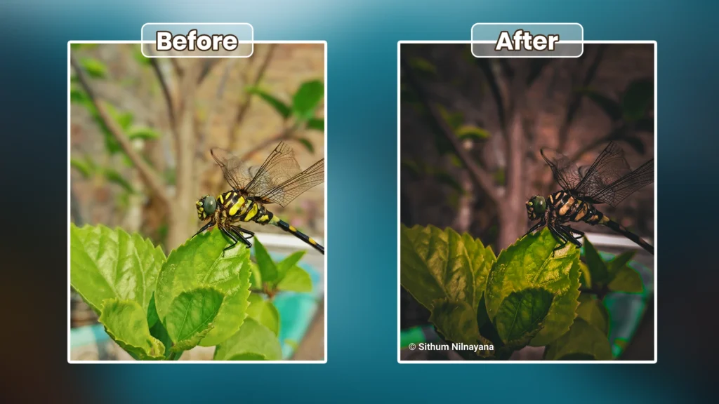
Macro shots are where I actually worried the preset would fall apart. Fine detail — wing veins, the texture on a leaf edge — is exactly what gets crushed when you push shadows aggressively. But this dragonfly shot held its detail well. You can still trace every vein in the wings even with the background pushed into that warm, moody brown. The green eye almost glows against it now, which I didn’t plan but I’m not complaining about either.
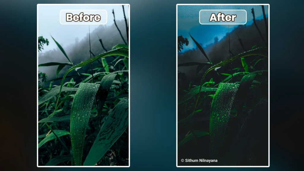
This is probably my favorite result out of the six, if I’m honest. Blue hour shots already have that cool, moody base to work with, and the preset just leans into it — the water droplets on the leaf go from soft silver to almost glowing green-white, and the blue in the sky deepens without turning muddy or grey. This is the kind of shot the preset was basically built for.
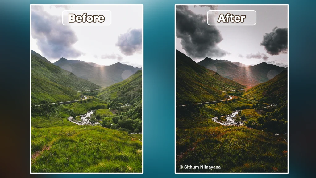
Landscapes are where the split toning really shows itself. The clouds go from flat grey to something with actual weight and drama, and the hillsides pick up that earthy green without losing the warm light beam breaking through the mountains in the center. I was a little nervous that beam of light would get crushed along with the shadows, but it survived — the contrast curve protects highlights even while shadows go deep.
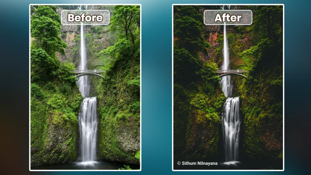
This is a genuinely tricky exposure — bright white water falling through a scene that’s otherwise mossy and dark. The preset handles that contrast reasonably well; the water stays bright and clean instead of getting dragged down with everything else, while the surrounding rock and moss pick up that deep olive tone. It’s not perfect — I’ll be honest, I did have to nudge the whites up slightly afterward on this one, it wasn’t a one-click miracle here.
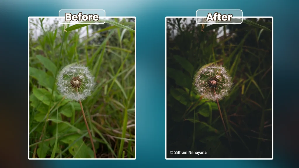
Last one, and another darker macro scene. The seed head itself stays crisp and bright against a background that’s gone almost black-green, moody in a way that makes the little details — every single seed thread — stand out more than they did in the flatter original.
Looking at all six side by side, the pattern’s pretty obvious. This preset loves green. Forests, hills, wet leaves, overcast light, anything with natural greenery in the frame — that’s its home turf. It’s not a “works on literally everything” preset, and I’d rather tell you that now than let you find out after downloading it.
What Kind of Photos Work Best With This Preset
Green is really the operative word here. Anything shot outdoors with natural foliage — forest trails, hillsides, garden shots, even a portrait with greenery behind the subject — is going to respond well, especially if it was taken during overcast weather, early morning, or that hour just before sunset when the light gets soft and warm at the edges. The mistier or more overcast the original shot, the better this preset tends to work, honestly, because it’s already got that moody base to build on.
Where it struggles is anywhere the color palette isn’t green-dominant. I tried this on a beach sunset shot a few weeks back — lots of orange, pink, warm sand tones — and it just looked wrong. The desaturation on the orange channel that’s supposed to make green pop instead made the whole sunset look dull and lifeless. Same story with indoor shots under artificial light; the color temperature fights against the earthy tone shift and you end up with a weird greenish cast over everything, skin included.
Portraits without any greenery in the frame are hit or miss too. If someone’s standing against a plain wall or an urban background, the shadow-deepening still works fine, but you lose that signature “wild earth” character since there’s no green for the preset to lean on. It’s not broken in those cases, it just isn’t doing what it was built to do.
How to Use the Wild Earth Moody Preset
Getting this applied takes about thirty seconds once you’ve got the file, whether you’re on your laptop or just editing off your phone between shots.
On desktop (Lightroom Classic or the regular Lightroom app):
- Download the DNG file below.
- Open Lightroom and go to your Presets panel on the left side.
- Right-click and choose “Import Presets,” then select the downloaded DNG file.
- Open any photo, click on Wild Earth Moody in your presets list, and it applies instantly.
On mobile (Lightroom app for Android or iOS):
- Download the DNG file to your phone’s storage.
- Open Lightroom mobile, tap the “+” icon, and select “Add a Preset” or import via the Profile/Preset tab depending on your app version.
- Once it’s added, open a photo, tap the Presets icon at the bottom, and select Wild Earth Moody from your list.
That’s the whole install. After it’s applied though, don’t just leave it there — every photo has different lighting, so I’d always nudge the exposure slider up or down a touch depending on how bright or dark your original shot was. If shadows feel too crushed on a particular photo, pull the Shadows slider up maybe 5-10 points. It only takes a second, and it makes a real difference on inconsistent lighting conditions.
Download the Free DNG Preset
So that’s Wild Earth Moody — one DNG file, works on both Lightroom desktop and mobile, and it’s completely free. No sign-up, no catch. I built this for my own shoots first and figured other people dealing with the same flat, lifeless green problem might get some use out of it too.
You get a single preset file that installs in seconds and gives you that deep, earthy, cinematic look on nature and outdoor shots without spending twenty minutes manually adjusting sliders every time. Just remember what we covered above — it shines on green-heavy, natural-light shots, and might need a small manual tweak on trickier lighting.
Honest Tips & Things to Know Before You Apply It
There’s a piece of advice that gets thrown around a lot in preset communities — “one good preset should work on any photo, just adjust exposure a bit.” I don’t really agree with that, and honestly I think it sets people up to be disappointed. A preset is built around a specific color relationship in the original file. Change the dominant colors in your scene and you’re not just tweaking exposure anymore, you’re fighting against decisions baked into the HSL panel.
What actually works, in my experience, is knowing which two or three sliders to touch when a photo doesn’t respond the way you expected. For Wild Earth Moody specifically, if a shot looks too dark or muddy after applying it, the Shadows slider is almost always the fix — bump it up 10 to 15 points and you’ll get most of the detail back without losing the mood. If skin tones look a bit off in a portrait, pulling back the Tint slightly toward magenta usually corrects it. I’m still not fully sure why certain warm-toned indoor shots react so unpredictably with the split tone — it’s something I want to dig into more before I build the next version of this.
What Kind of Results You Can Expect
At its best, this preset gives your outdoor shots that feeling of a still frame pulled from a moody nature documentary — deep, textured shadows, greens that feel grounded rather than artificial, and a sort of quiet heaviness that makes an ordinary hillside or forest trail look like it belongs somewhere far more dramatic. It’s the “postcard from a rainy hike” look, if that makes sense — the kind of photo that makes people ask where you shot it.
That said, results genuinely do vary depending on what you’re starting with. A green-heavy overcast shot is going to transform dramatically; a warm indoor portrait is going to change far less, and maybe not for the better. I’d rather you go in knowing that than expect the exact same jaw-drop every single time. When it clicks though, it really clicks — that’s the whole reason I kept refining this thing through four or five versions instead of settling for the first one.
Wrapping Up
That’s Wild Earth Moody, from that rainy afternoon shoot to the file sitting in the download button above. If you end up using it on something, I’d genuinely love to see how it turns out — drop a comment below with your results, or let me know if it fought you on a particular type of photo. I’m always tweaking things, so feedback actually goes somewhere here. More presets are in the works too, so stick around if this one’s your kind of look.

H S N De Silva is a graphic designer and digital creator with over 3 years of hands-on experience in visual design and media editing. Through Sonic LK, he shares practical tutorials, step-by-step guides, and ready-to-use templates to help beginners and intermediates master tools like Adobe Photoshop, Illustrator, and Premiere Pro — without the overwhelm.