Introduction
In the realm of visual communication, the principles of design serve as fundamental guidelines that inform and shape a creator’s approach to organizing elements within a composition. These principles not only enhance aesthetic appeal but also contribute significantly to the clarity and effectiveness of the communication being conveyed. By adhering to these established design principles, designers are better equipped to influence how viewers perceive information, fostering an engaging and efficient interaction with their designs.
The significance of understanding design principles cannot be overstated, as they enable creators to make informed decisions about layout, color schemes, typography, and other components that influence visual hierarchy and balance. A well-designed work communicates its intended message promptly, guiding the viewer’s eye to the essential aspects and ensuring a cohesive and harmonious experience. In contrast, neglecting these principles can result in confusion, distraction, and an ineffective portrayal of the intended message.
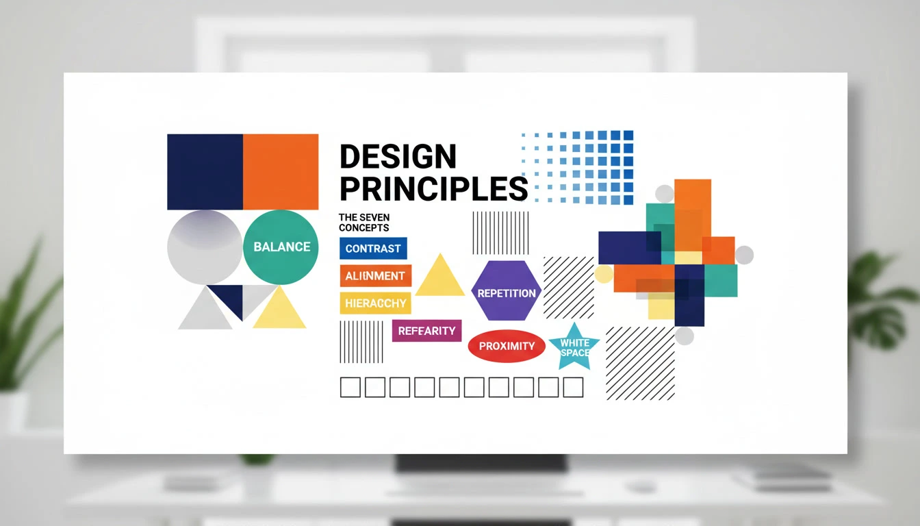
This article will delve into the seven key principles of design that lay the groundwork for successful visual communication. These principles are contrast, emphasis, balance, alignment, repetition, proximity, and white space. Each principle serves a distinct purpose and works in conjunction with the others to facilitate a comprehensive understanding of effective design. Understanding these principles will not only enhance a designer’s skill set but also elevate the quality and impact of their work, leading to a more competent and versatile approach to visual design. Through exploring these seven principles, readers will gain valuable insights that can be applied to various design contexts, providing a robust foundation for both aspiring and seasoned designers alike.
What are Design Principles?
Design principles are foundational guidelines that govern the arrangement and organization of visual elements in a composition. These principles differ significantly from design elements, which refer to the individual components such as lines, shapes, colors, and textures that constitute a visual design. Understanding design principles is crucial for any designer or creative professional seeking to craft compelling, effective visual communication.
At their core, design principles, such as contrast, balance, hierarchy, alignment, repetition, proximity, and white space, serve as the framework through which design elements are manipulated. By applying these principles, designers can create compositions that are not only aesthetically pleasing but also functional and effective in conveying the intended message. For example, the principle of contrast can enhance readability and draw attention to important information, while white space can provide breathing room, making a design feel more organized and less cluttered.
Moreover, an understanding of design principles can significantly improve the decision-making process in design projects. Designers who are well-versed in these principles are better equipped to evaluate their work critically and make informed adjustments where necessary. The principles guide designers in creating harmonious and coherent works that lead the viewer’s eye naturally through the composition. Ultimately, knowing how to effectively leverage design principles can elevate a designer’s ability to communicate ideas clearly and effectively.
Incorporating these principles into design practice not only enhances creativity but also ensures that the resulting work resonates with the target audience. A solid grasp of design principles is essential for creating visuals that are memorable, impactful, and ultimately successful in achieving their purpose.
The 7 Key Principles of Design
Design is a discipline that encompasses various principles which serve as guidelines for creating visually appealing and functional compositions. Among these, the seven key principles of design play a fundamental role: contrast, balance, alignment, visual hierarchy, repetition, proximity, and white space. Understanding and applying these principles is crucial for effective design communication.
1. Contrast
Contrast involves the juxtaposition of differing elements to highlight their differences, making certain aspects of the design stand out. For example, using light text on a dark background creates an engaging highlight. The importance of contrast is evident in web design, where it facilitates readability and guides user focus.
2. Balance
Balance refers to the distribution of visual weight within a design. It can be symmetrical or asymmetrical, with each approach offering a distinct aesthetic. An example of symmetrical balance would be a perfectly balanced layout on either side of a central axis, while asymmetrical balance provides visual interest and a dynamic feel. Achieving balance is essential in ensuring harmony and stability in the design.
3. Alignment
Alignment organizes elements in relation to one another, leading to a cleaner and more structured visual experience. This principle enhances the flow of the design, allowing viewers to navigate information seamlessly. For instance, aligning text to the left or right creates a professional appearance and ensures that design components relate to one another logically.
4. Visual Hierarchy
Visual hierarchy guides the viewer’s eye through a design according to the importance of elements. By manipulating size, color, and placement, designers can create a clear road map for information. A good example is a website where the headline is larger and bolder than the body text, drawing attention effectively.
5. Repetition
Repetition reinforces a design’s overall unity and consistency by repeating certain elements such as colors, shapes, or fonts throughout the composition. This principle can be seen in branding, where logos are repeated across various marketing materials to strengthen brand identity.
6. Proximity
Proximity refers to placing related elements close together to foster a connection. This principle aids in organizing information, making it easier for audiences to understand relationships within the content. For instance, grouping related items in a menu ensures users can navigate through options without confusion.
7. White Space
White space, or negative space, is the intentional blank area surrounding design elements. Far from being mere emptiness, it improves legibility and focuses attention where it is needed. Effective use of white space can dramatically affect the aesthetics and function of both print and digital designs, providing breathing room and enhancing user experience.
Principle 1: Contrast
Contrast is a fundamental principle in design that involves juxtaposing different elements to create visual interest and clarity. This principle serves to enhance the legibility and impact of designs by ensuring that important elements stand out and are easily distinguishable from one another. In graphic design, contrast can be achieved through various means such as color, size, shape, and texture. By employing these aspects effectively, designers can guide the viewer’s attention and facilitate better understanding of the content presented.
A quintessential example of effective contrast can be found in the world of print media, particularly in magazine layouts. Lettering might be set in bold, dark typeface against a white background to ensure that the text commands attention. Similarly, an image can draw the viewer’s gaze if it is strategically placed beside a less vibrant or monochromatic section of design, allowing the image to pop. In web design, contrasting colors such as a bright call-to-action button against a muted background can significantly improve user interaction rates, encouraging clicks and engagement.
Moreover, contrast not only serves aesthetic purposes but also functional advantages. Hierarchical structures in textual content where headings are larger and bolder than the body text create a visual hierarchy that enhances readability. In a digital context, utilizing contrast between background colors and interface elements can contribute to accessibility, ensuring that users with visual impairments can navigate content more efficiently. By prioritizing contrast, designers can create environments that are not only visually appealing but also user-friendly and effective in conveying messages.
Principle 2: Balance
Balance is a fundamental principle in design that contributes significantly to the overall stability and visual integrity of a composition. It refers to the distribution of visual weight within a layout, ensuring that different elements coexist harmoniously. There are three main types of balance to consider: symmetrical, asymmetrical, and radial balance.
Symmetrical balance is achieved when elements are evenly distributed around a central axis, leading to a mirroring effect. This type of balance offers a sense of formality and order, commonly found in classic designs. For instance, a business card may utilize symmetrical balance to project professionalism, featuring equal elements on both sides, such as logos and contact details. This approach creates a stable and reliable impression.
On the other hand, asymmetrical balance does not rely on mirrored elements; instead, it achieves balance through varying weight and size. Asymmetrical designs often create a more dynamic feel, with elements strategically placed to draw the viewer’s eye. A website design might employ asymmetrical balance by positioning a large image on one side while using smaller text on the opposite, encouraging visual engagement without sacrificing stability.
Radial balance involves arranging elements around a central focal point, creating a sense of movement and direction. This approach is frequently used in circular designs, such as logos or mandalas, where the elements radiate outward from the center. The inclusiveness of radial balance can effectively guide the viewer’s attention to a central concept or message.
Overall, balance is crucial for creating stability in visual design. By thoughtfully considering symmetrical, asymmetrical, and radial balance, designers can craft compositions that resonate with audiences while maintaining aesthetic appeal.
Principle 3: Alignment
Alignment is a fundamental aspect of design that plays a crucial role in establishing organization and connection among various elements within a visual composition. When objects are aligned effectively, they create an invisible structure that guides the viewer’s eye and enhances overall coherence. This principle ensures that elements relate to each other visually, thus contributing to a clear and orderly layout.
There are several practical methods to achieve proper alignment in design. One effective approach is to utilize a grid system, which acts as a framework to align elements accurately. By adhering to predetermined horizontal and vertical lines, designers can ensure consistency, making the layout more aesthetically pleasing. This kind of structured approach not only brings harmony to the design but also fosters a sense of professionalism.
Moreover, alignment can be enhanced through the use of margins and paddings. Ensuring that there is enough space around text and images without overcrowding can improve readability and draw attention to important components of the design. This practice helps in establishing visual hierarchy, guiding viewers through the content in a logical manner.
Another effective way to achieve alignment is through the careful positioning of elements. When text blocks, images, and other components are strategically arranged along common edges or centers, it promotes a sense of connectedness and flow. This technique can be specifically useful in web design, where navigation menus and content areas need to function harmoniously to improve user experience.
In conclusion, mastering alignment in design is essential for creating cohesive and engaging layouts. By using grids, managing spacing, and strategically placing elements, designers can establish meaningful connections between visual components, promoting clarity and effectiveness in their work.
Visual Hierarchy
Visual hierarchy is a fundamental design principle that dictates how elements are arranged in a layout to guide viewer attention. It establishes a hierarchy among design elements, ensuring that the most important information is easily noticeable first. This principle implements the use of size, color, contrast, alignment, and proximity to create a clear path for the viewer’s eyes to follow. As a result, effective visual hierarchy helps users to easily navigate through content, comprehend information quickly, and facilitate a more coherent visual experience.
One common technique to establish visual hierarchy is through the use of size. Elements that are larger typically attract more attention and signify importance. For example, a large headline at the top of a web page immediately draws the viewer’s focus, indicating that it contains critical information. In contrast, smaller text can be utilized for less important details, allowing the viewer to easily distinguish between major and minor points.
Color also plays a crucial role in forming visual hierarchy. Bright colors tend to stand out and capture attention, while muted colors recede into the background. By using contrasting colors for buttons or key messages, designers ensure that these elements become focal points within the design. Moreover, strategic alignment and proximity can enhance clarity and group related content, further aiding in the hierarchization of information.
For instance, in a website layout, a prominent call-to-action button may be placed centrally and highlighted with a bold color and large font size, juxtaposed against a clean background, allowing users to quickly recognize the desired action. By implementing these techniques, the visual hierarchy of a design not only organizes content effectively but also significantly enhances user engagement and comprehension.
Principle 5: Repetition
The principle of repetition in design is vital for establishing a sense of unity and consistency throughout a composition. By utilizing repetition, designers can create a cohesive visual experience that enhances the comprehension and memorability of the information presented. Repetition can manifest itself in several ways, including the use of similar colors, shapes, fonts, and patterns, thereby forming a recognizable theme across different elements.
For example, consider a website that incorporates the same button style across various pages. This repeated element not only simplifies the user’s navigation but also strengthens brand identity. When users encounter familiar components as they explore the site, they associate these elements with the overall aesthetic of the brand, making the experience more intuitive and engaging.
Another effective application of repetition can be observed in print media, such as brochures or flyers. By adopting a consistent color palette and typography, designers create a visual rhythm that guides the audience through the content. For instance, headings might consistently utilize a bold serif font, while body text is presented in a lighter sans-serif typeface. This harmonious use of typography not only beautifies the design but also ensures clarity in communication.
In product packaging, repetition can be successfully employed to maintain a unified brand image. Many successful brands utilize recognizably repeated elements, such as logos and color schemes, that run across product lines. This not only fosters brand loyalty by providing visual familiarity but also leads customers to easily distinguish and choose their products in competitive markets.
Overall, the principle of repetition is essential for creating designs that are not only aesthetically pleasing but also effective in conveying information and enhancing user experience. It reinforces brand identity, guides the viewer’s attention, and creates a sense of order and predictability across various design elements.
Principle 6: Proximity
Proximity in design refers to the spatial relationships between different elements. The principle emphasizes that elements that are close to each other are perceived as related, whereas those placed further apart are considered separate. Understanding and implementing this principle is crucial in enhancing readability and organization within any design.
For beginners, consider a simple example: a business card layout. If a person’s name, title, and contact information are positioned close together, it creates a cohesive block of information that is easy for the viewer to scan. Conversely, if these elements are scattered across the card, it creates confusion and hinders quick comprehension, thus reducing the card’s effectiveness.
In digital design, proximity can be seen in web layouts. For instance, related aspects like headings and subheadings should be grouped together, while unrelated content, such as advertisements or unrelated links, should be distanced from the main text. This intentional layout aids users in navigating content effortlessly, promoting a better user experience.
Moreover, using proximity can significantly influence visual hierarchy. Elements that are grouped, such as image captions with their corresponding images, draw attention together, allowing the viewer to form associations swiftly. This can guide the audience’s eye through the design, directing focus to key areas without overwhelming them.
Ultimately, mastering the principle of proximity can transform a cluttered, disorganized design into a clear and harmonious layout. By learning to arrange elements thoughtfully, designers can enhance comprehension and make information more accessible, thereby improving the overall effectiveness of their work.
White Space as a Design Principle
White space, often referred to as negative space, pertains to the unoccupied areas of a design. It is crucial in providing breathing room for other elements within a layout, enhancing both functionality and aesthetic appeal. Contrary to the misconception that white space signifies emptiness, it actually contributes to an organized and coherent presentation of content. By strategically incorporating negative space, designers can greatly affect how viewers process and engage with information.
The significance of white space in design becomes evident when considering its impact on readability and comprehension. For instance, a text-heavy website can quickly overwhelm users, leading to a decrease in engagement. However, by integrating ample white space around text blocks, designers can create a more inviting atmosphere. This allows for easier scanning, enabling readers to consume information without feeling fatigued. Effective use of white space thus not only enhances legibility but also directs the viewer’s attention to key elements within the design.
Moreover, white space plays a critical role in achieving visual balance. When elements are crowded together without sufficient spacing, the overall design can appear chaotic, which detracts from the user experience. On the other hand, when there is a thoughtful arrangement of both positive elements (like text, images, and buttons) and negative space, a sense of harmony is established. This balance encourages user interaction and fosters a more pleasurable navigation experience. Examples of brands that excel in the use of white space include Apple and Airbnb, whose minimalist designs allow users to focus on the product or service without distraction.
In conclusion, white space is an essential design principle that enhances readability, improves visual balance, and ultimately leads to a more effective overall design. Its utilization can transform even the simplest layout into a sophisticated and engaging platform for communication.
How These Principles Work Together
The seven key principles of design are not isolated concepts; rather, they function in unison to create visually cohesive and appealing compositions. These principles contrast, balance, alignment, repetition, proximity, hierarchy, and white space interact with one another in various ways, enhancing the overall design experience.
For instance, contrast can be used effectively to draw attention to vital elements within a design, such as a call to action. By utilizing contrast through color, size, or shape, designers can ensure that critical information stands out. This principle naturally complements the idea of hierarchy, which structures elements according to their importance, allowing viewers to navigate the design intuitively and efficiently. Without effective hierarchy, even the most striking contrast can lead to confusion and diminish a design’s impact.
Similarly, balance plays an indispensable role in creating harmony in design. It ensures that no single element overwhelms the others, promoting a sense of stability. When combined with alignment, which organizes elements along desired margins or axes, these principles ensure that the layout feels intentional and structured. This synergy allows viewers to easily process information without feeling disoriented.
The principles of repetition and proximity strengthen the cohesive feel of a design, encouraging a visual rhythm and connection among elements. Repetition helps to create familiarity, which, when combined with proximity, establishes relationships between related components, allowing them to work symbiotically. This interconnectedness can foster a stronger overall message.
Finally, the proper use of white space is crucial in providing breathing room within a composition. It allows for focus on the various elements, enhancing their relationships while preventing visual clutter. Thus, each principle not only contributes to the design independently but also amplifies the effectiveness of others, cultivating an environment where visual clarity and aesthetic appeal thrive together.
Practical Tips for Applying the 7 Principles
Understanding the seven fundamental principles of design contrast, repetition, alignment, proximity, balance, hierarchy, and white space can greatly enhance your work. To effectively implement these principles, consider the following actionable tips.
First, when utilizing contrast, ensure that elements that need attention stand out. For instance, use bold colors against a neutral background to make text readable. Avoid using too many contrasting elements that may confuse or distract the viewer.
Next, repetition is key in creating coherence and unity. Establish a consistent style by choosing a color palette and fonts that reflect your theme. Be cautious not to overdo it; while patterns can unify a design, excessive repetition can lead to monotony.
Alignment creates order and organizes information smoothly. Whenever placing elements, ensure they relate to one another in a structured manner. It’s a common mistake to center all elements aimlessly, which can lead to a disjointed appearance.
Proximity refers to grouping related items together. This principle helps in conveying relationships to the audience clearly. A frequent pitfall is leaving too much space between related content, which can signify that it is unrelated. Conversely, cramping items too closely can create visual clutter.
Balance is essential for achieving visual stability. Practice symmetry in designs for a traditional look, or explore asymmetrical layouts for a dynamic feel. Keep in mind that imbalance can often lead to discomfort for the viewer.
When establishing hierarchy, prioritize important information through size, color, and style variations. A common error is treating all elements with equal emphasis, which dilutes the significance of key content.
Finally, white space, or negative space, is crucial for enhancing clarity. Use it strategically to avoid overcrowding and give breathing room to your design. Balancing white space with elements can guide viewer attention effectively.
In summary, keep a checklist of these principles handy while designing. By referring to it, you can ensure that each project not only adheres to these key principles but also avoids common pitfalls that may detract from the overall impact of your work.
Conclusion
In reviewing the seven key principles of design including contrast, repetition, alignment, hierarchy, balance, proximity, and white space—it is clear that these principles serve as essential guidelines for creating visually appealing and effective works. Each principle plays a crucial role in ensuring that designs convey the intended message and engage the audience effectively.
Practicing these principles can lead to significant improvements in a designer’s work. By focusing on contrast, designers can enhance the readability and visual interest of their projects. Repetition creates cohesion, while alignment reinforces organization and clarity. Hierarchy ensures that the most important elements stand out, guiding the viewer through the design intuitively.
Furthermore, balance distributes visual weight, fostering a sense of stability, while proximity relates to the grouping of elements based on their significance. This can help in creating a more navigable and user-friendly design. Lastly, the facet of white space is often underrated, yet it can be one of the most powerful tools for enhancing focus and creating an overall aesthetic sense.
In light of these principles, designers are encouraged to continually practice and experiment. Engaging with the principles of design not only refines technical skills but also fosters innovation and creativity. By implementing these fundamental concepts into projects, designers can cultivate their unique style while adhering to the core tenets of effective design. Thus, a robust understanding and application of design principles can greatly enhance any visual communication effort, making the pursuit of design mastery a worthwhile endeavor.
Frequently Asked Questions about the Principles of Design
Understanding the principles of design is crucial for anyone seeking to enhance their design skills, whether as a novice or an experienced artist. Below, we address common questions related to these design principles.
What are the seven principles of design?
The seven key principles of design are balance, contrast, emphasis, movement, pattern, rhythm, and white space. Each principle serves a distinct purpose in the overall composition and helps guide the viewer’s experience of the design.
Why are the principles of design important?
These principles are essential because they provide a foundational framework for creating visually appealing and effective designs. By applying these principles, designers can communicate messages more clearly, engage audiences effectively, and create harmonious compositions that attract attention.
How can beginners apply these principles in their designs?
Beginners can start by experimenting with each of the principles individually. For example, they may create a piece that focuses solely on balance, using symmetrical or asymmetrical arrangements. Gradually, incorporating contrast and white space can enhance the clarity and impact of the work. It can be beneficial to study existing designs analyzing how professional designers utilize these principles can provide insights that inform personal creative processes.
Can the principles of design be combined?
Absolutely, the principles of design often work in synergy. For instance, effective use of contrast can enhance emphasis, while pattern can create rhythm in a design. Understanding how these principles interact allows for more complex and sophisticated designs, making them more engaging and aesthetically pleasing.
By addressing these frequently asked questions, we hope to demystify the principles of design, encouraging both beginners and experienced designers to explore and apply them in their creative endeavors.

H S N De Silva is a graphic designer and digital creator with over 3 years of hands-on experience in visual design and media editing. Through Sonic LK, he shares practical tutorials, step-by-step guides, and ready-to-use templates to help beginners and intermediates master tools like Adobe Photoshop, Illustrator, and Premiere Pro — without the overwhelm.